SeeYa
Project
Client:
What i did:
Year:
Brief
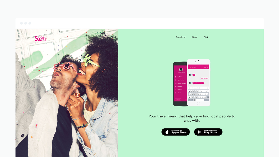
Your travel friend that helps you find local people to chat with. It`s free to join for everyone who live to travel. Chat with your friends or people with your interests near you. No ads, no premium content locked. Register easily with Facebook or Email. The project consist on iOS and Android App. Also I designed the Landing Page
Login/Register
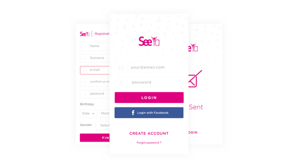
First of all needed an account for your profile. The requirements are very simple if you register via mail or even more using Facebook.
Search for people around you
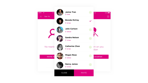
You can search for people who are around your location and invite them in the chat.
Tables
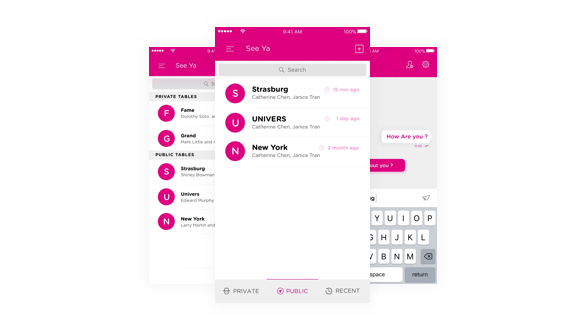
We call it TABLES instead of Rooms or Groups. The idea of tables supposed to be the bar table where you can hangout with peoples of can offer him/her a drink.
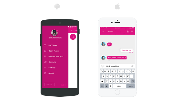
iOS and Android
It’s important to be consistent in booth platforms with the same look and feel of app usage. We created our design language instead of each platform one.
Colour Palette
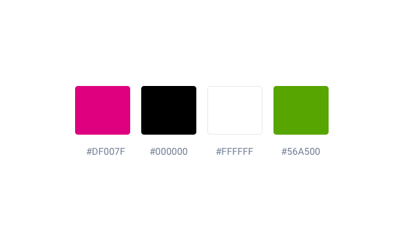
The main color in the palette is pink. We choose pink that means sweet, nice, playful, cute, romantic. Also this create a very unique look of the app.
Landing Page
The main reason of the seeya.im landing page is to drive traffic to App Store and Play Store, and to get some helpful information. There are 5 different page layouts: Home, Download, About, FAQ, Privacy Policy.
